Improving DebtFreeNorth’s Digital Presence

The Need for a Digital Presence

Numerous businesses had to adapt due the pandemic, and DebtFreeNorth (DFN) was no stranger to this. What formerly required an in-person meeting could now be finished through a Zoom call. This provided numerous opportunities to reach the entire nation, however, this also expanded the competition.

Team

  1. Adrian Lo
  2. Audrey Keene
  3. Ada Da

Constraints

  • 4 - Week Schedule
  • Website is hosted on WordPress
  • Work within DFN's existing workflow

Understanding Current Users

We used a variety of research techniques to compile as much information as we could. Our final design was heavily influenced by the following observations:

1. Research First
Users believed that financial institutions did not have their best interest in mind. They will conduct personal research & self evaluations before contacting a business.
Source: Google Analytics, User Surveys, & Competitive Research.
2. Mobile > Desktop
The current website was not optimzed for mobile usage, a large chunk of DFN's traffic.
  • Mobile users accounted for 58% of total users
  • There was an 80% bounce rate.
  • 90% of users viewed two pages total per session
    Google Analytics & Site Audit
Source: Google Analytics & Site Audit
3. Forms of Communication
Depending on the type of information, people preferred different forms of communication.
  • Web Portals for confidential documents
  • Texts for time sensitive information
  • Emails for financial updates
Source: User Surveys

The Current System

Due to limited time, we had to focus our scope of work. We summarized information provided by DFN in the kickoff email and meeting into two flows: Client Acquisition and Account Creation.

We believed that at this stage, a heavier focus on Client Acquisition aligned with DFN’s business goals of increasing conversion rates and streamlining onboarding.

Coming up With Ideas

We created a User Journey Map to get the user's POV and break down DFN's current system into digestible sections. This was useful during our ideation process as it helped identify points in the process where we could create an impact for users.

Putting DebtFreeNorth on the Digital Map

We reorganized the site using Site Map and User Flow to understand and improve information hierarchy. This was then transformed into Lo-Fi Wireframes, which were used to fine tune details within the prototype with Usability Testing.

So What's New?
a Responsive Design
58% of users who accessed the site through their mobile device. We created a consistent & responsive design for desktop and mobile.
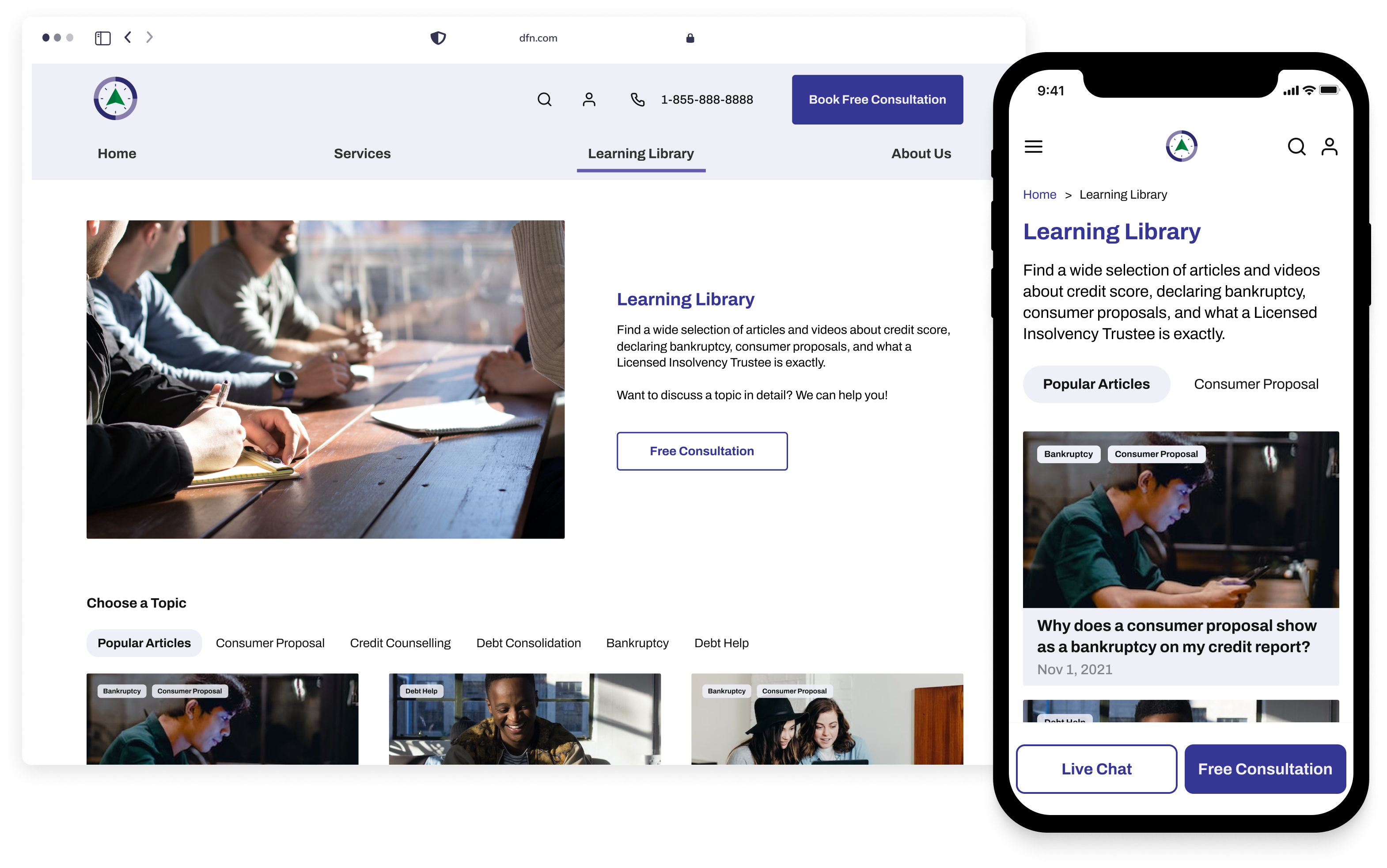
Responsive Design
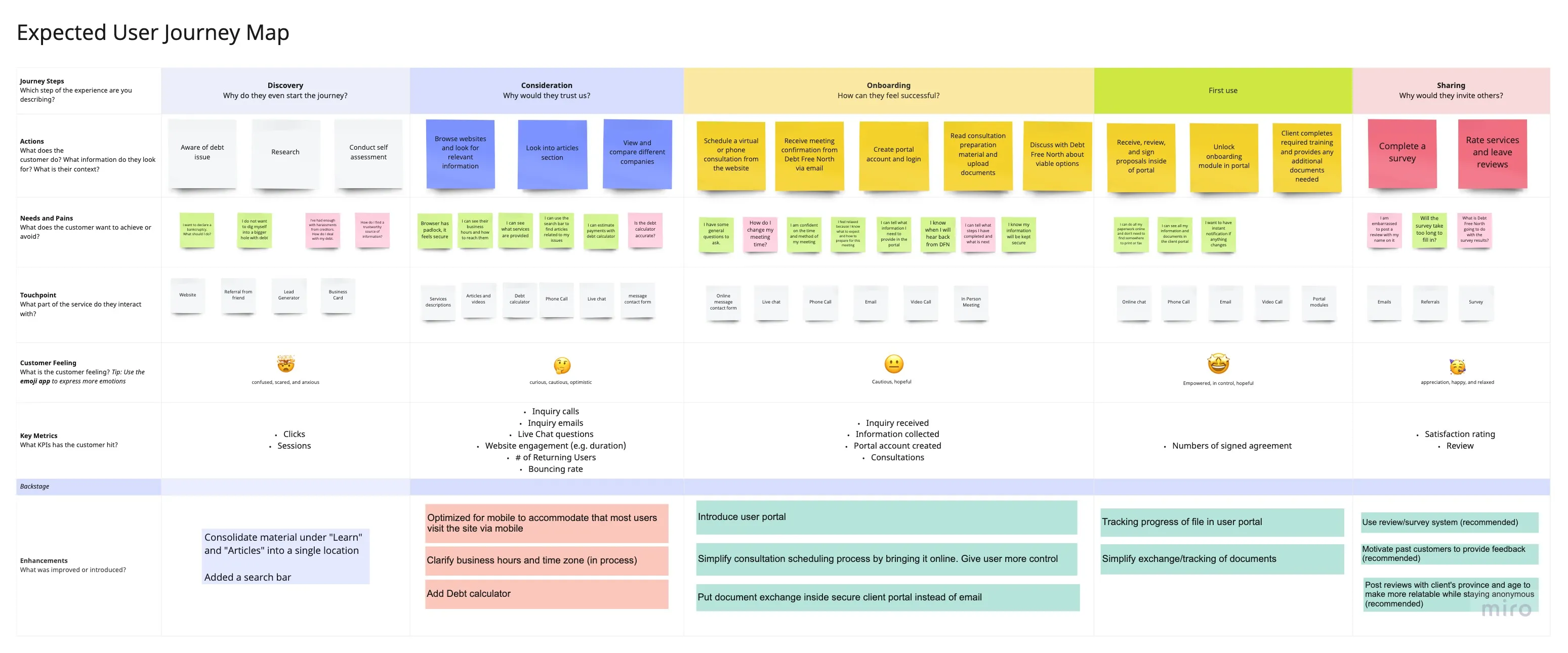
Restructuring Data to Funnel Users to Increase Conversion Rates
Google Analytics showed that there were two dominant user flows: research and contact. Information hierarchy was restructured to direct users towards research and articles, with contact CTAs readily available throughout the site.

Also, it was important to provide the opportunity for users to conduct research and self-assessments in this industry. Surveys showed that users did not trust financial companies and preferred to gather information themselves first.
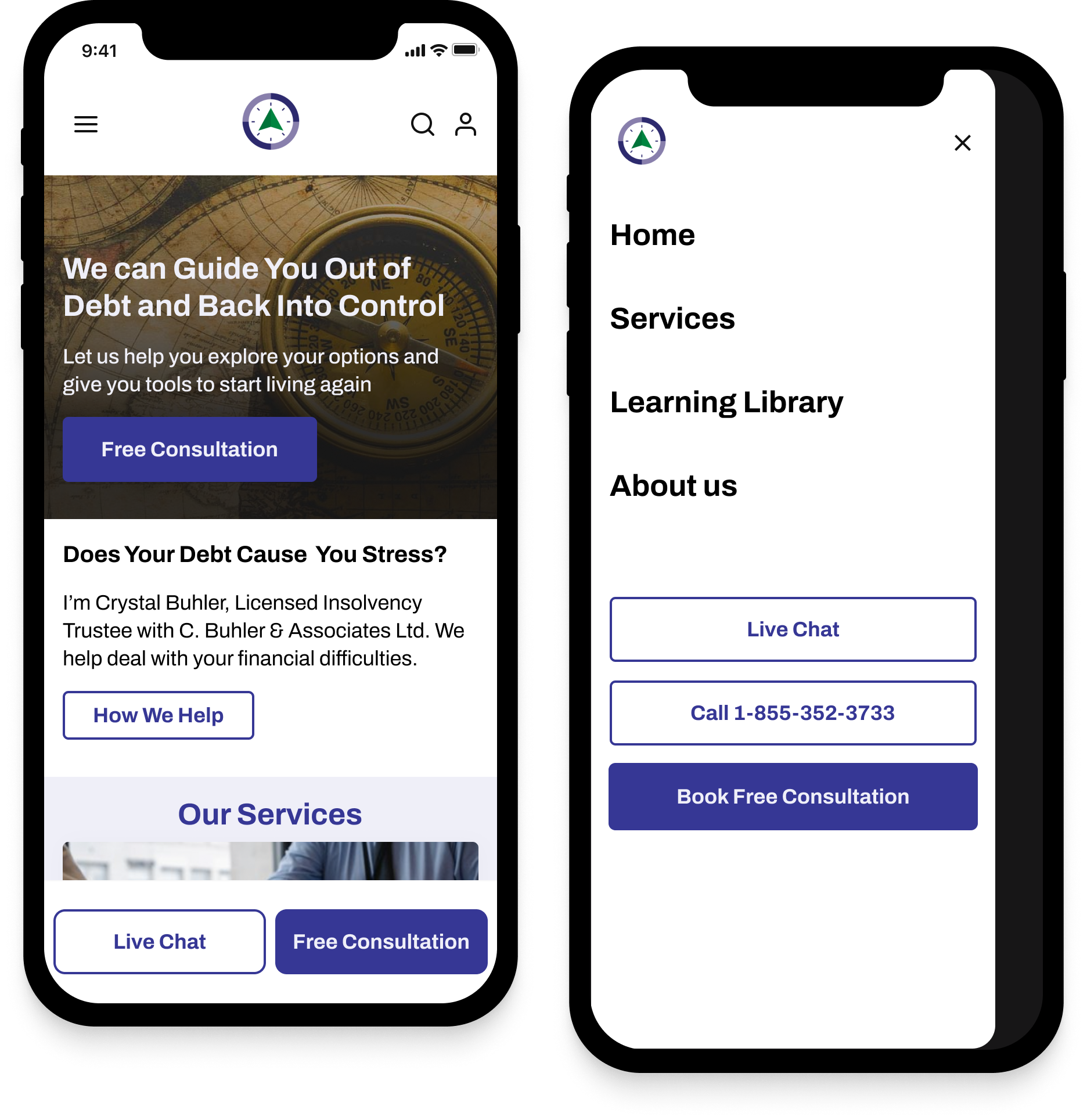
Prominent CTA
Buttons
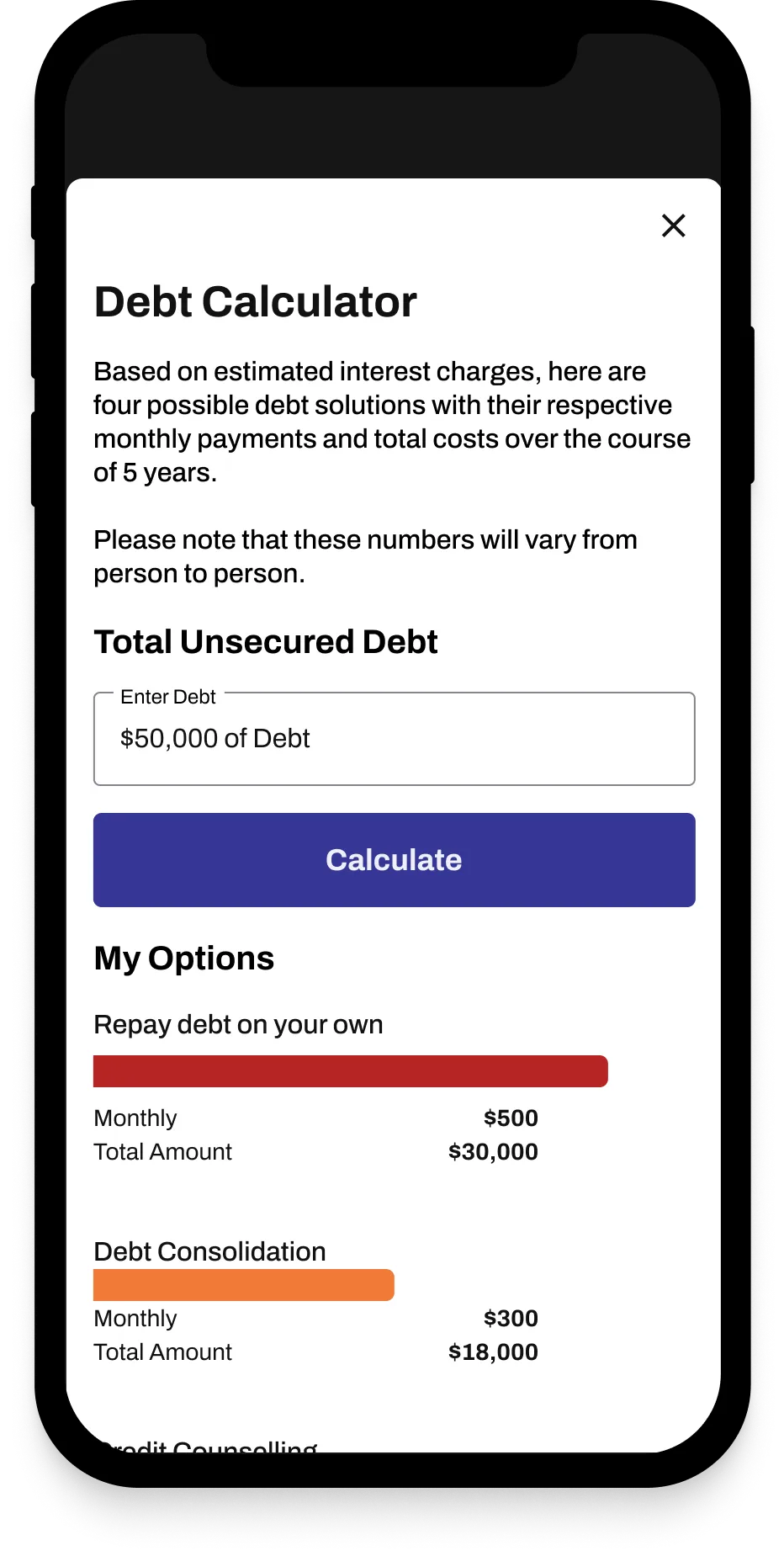
Self Assessment Debt Calculator
Implement a Scheduling System
In the kick-off meeting, DFN mentioned that they would lose track of potential leads before they were input into the system. We proposed a scheduling system with the following details:
  • DFN has clients across multiple timezones and it needed to be clear to avoid confusion when having a meeting
  • Friction was added to the Date Picker by showing only the day. This prompted users to schedule an earlier meeting date.
  • As a small business, DFN wanted to emphasize their flexibility with their working hours and duration of the consultation.
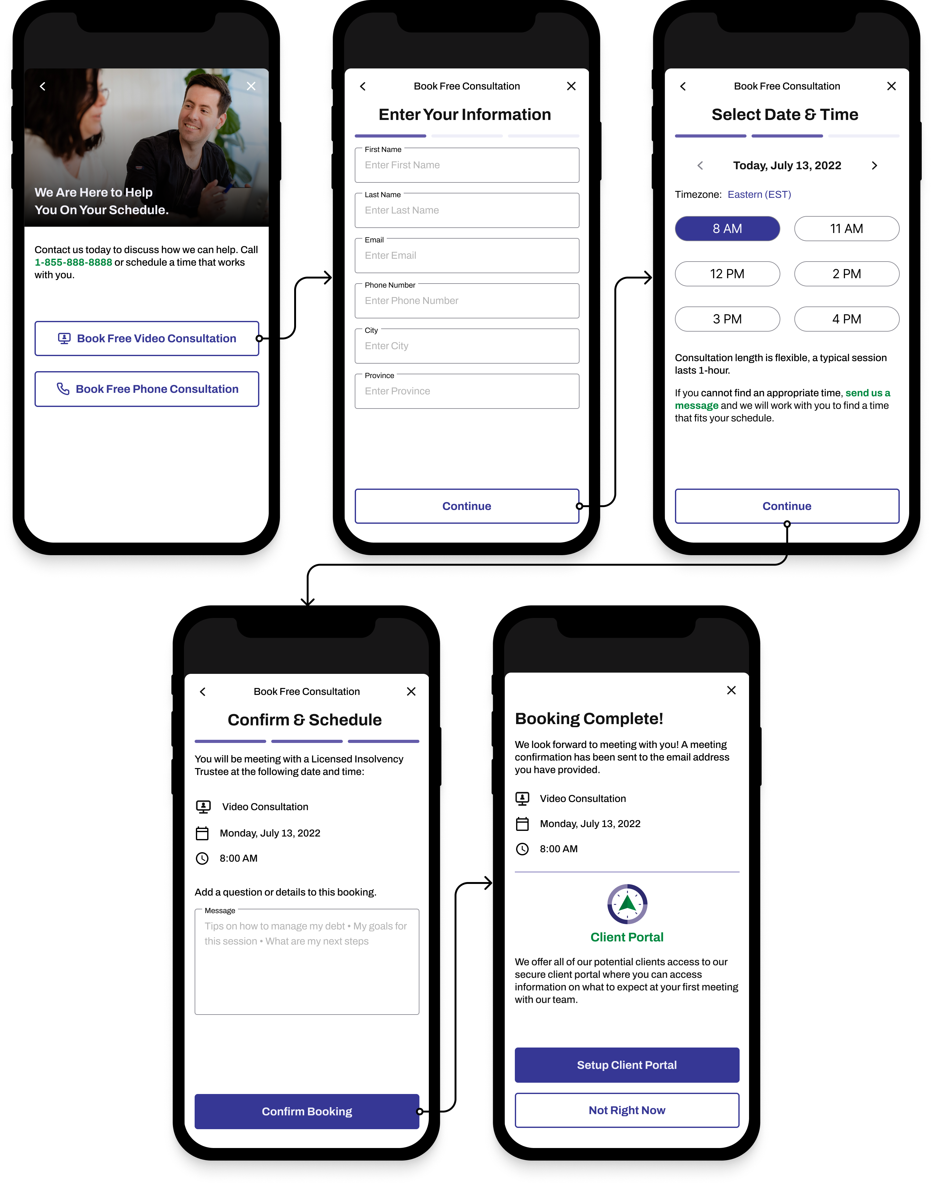
Scheduling System
Introduce a Portal System to Streamline Onboarding and Increase Security
Surveys revealed that users preferred sending over sensitive financial documents over a secure system. It also helped streamline clients, which was one of DFN’s concerns.

We found a WordPress plugin (clientportal.io) that was largely customizable and designed a layout that would fit with DFN’s current onboarding flows: Uploading Client Details and Providing Supplementary Learning Material.
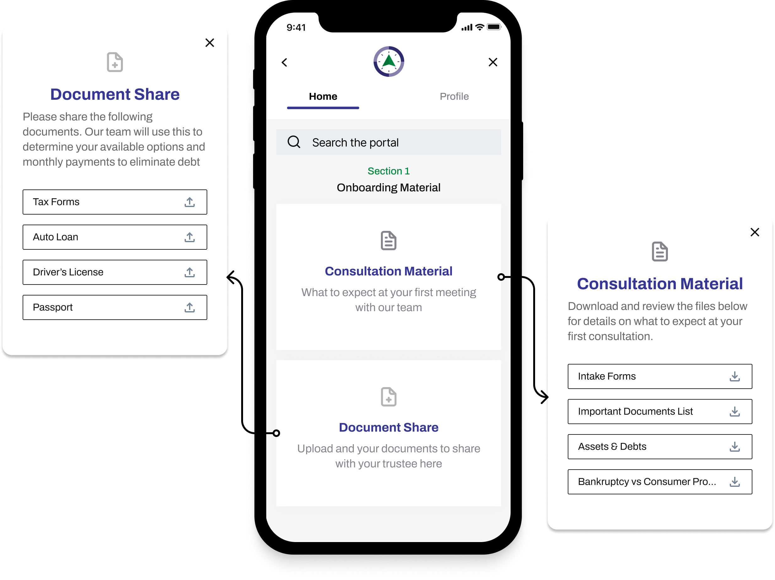
Portal System
Fine-tune Live Chat Feature
Usability testing showed that users associated the live chat with a bot. By adding Kevin’s work title, users knew they were talking to a key figure within the business.  

DFN brought to our attention that they were unable to reply to users who used the chat and left. By noting his response time (system state visibility), users were prompted to either stay longer or enter their contact information.
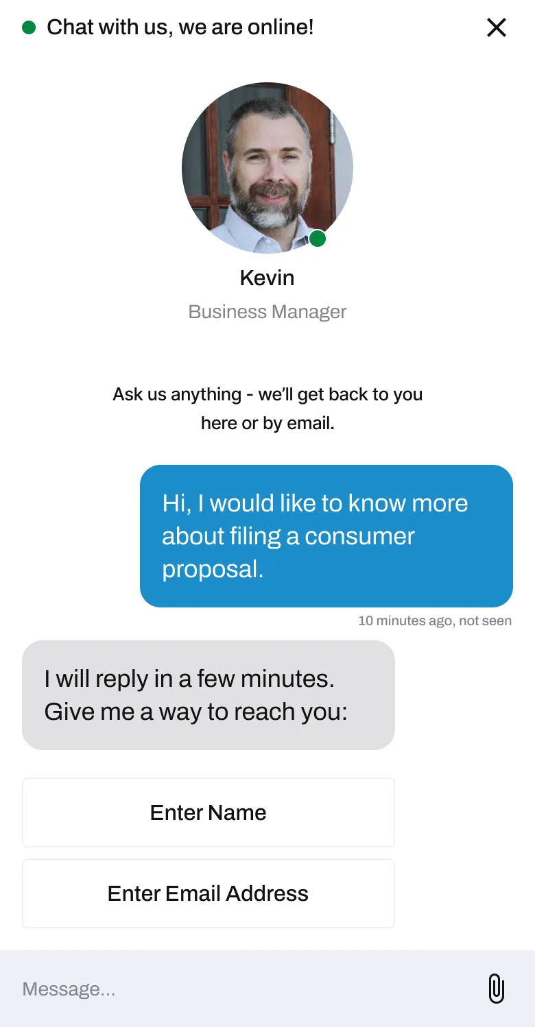
Live Chat Feature

Start of DFN’s Design Journey

Throughout the process, it was my goal to have a design system put into place. It was my understanding that DFN was at the beginning of their design journey and having a solid foundation to carry forward would help immeasurably.

If I Had More Time

I would redesign the DFN's current physical intake form into a digital form. This would work well with the proposed portal system and would allow DFN to have a centralized system that acts as a CRM.

Main Learnings

Communication is key, especially when working within a team of designers. Diverse viewpoints are necessary, but they can collide and cause conflict.

We had a system in place where each designer owned a certain process. Any changes or difference in opinion would start as a comment in the Google Doc or Figma file and then we would then discuss and decide on the direction as a team. This allowed for everyone's voice to be heard, ultimately leading to a better design.

Thank you for reading

I am always trying to learn more. Tell me about your projects or anything that you are currently interested in.
Adrian Lo
Adrian Lo